In the vast landscape of data visualization, creating interactive dashboards has become an art form that bridges the gap between complex data and human understanding. Today, we’ll explore how to craft compelling visual stories using two powerful Python libraries: Plotly and Streamlit.
The Power of Interactive Visualization
Imagine you’re a data detective, tasked with uncovering insights from mountains of information. Static charts, while useful, can only tell part of the story. This is where interactive dashboards (like Streamlit) shine – they allow users to explore data on their own terms, discovering patterns and insights that might otherwise remain hidden.
Setting Up Our Toolkit
First, let’s prepare our environment with the necessary tools:
import streamlit as st
import plotly.express as px
import plotly.graph_objects as go
import pandas as pd
import numpy as np

# For reproducibility
np.random.seed(42)
Building Our First Interactive Component
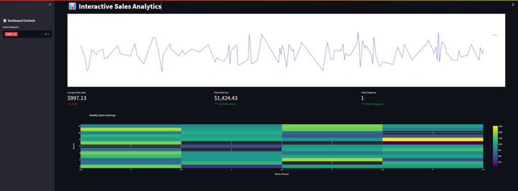
Let’s start with something engaging – a dynamic sales dashboard that responds to user input:
def create_sales_dashboard():
    st.title("📊 Interactive Sales Analytics")

    # Generate sample data
    dates = pd.date_range(start='2023-01-01', end='2023-12-31', freq='D')
    sales = np.random.normal(loc=1000, scale=200, size=len(dates))
    df = pd.DataFrame({
        'Date': dates,
        'Sales': sales,
        'Category': np.random.choice(['Electronics', 'Clothing', 'Food'], size=len(dates))
    })

    # Sidebar controls
    st.sidebar.header("📋 Dashboard Controls")
    selected_category = st.sidebar.multiselect(
        "Select Categories",
        options=df['Category'].unique(),
        default=df['Category'].unique()
    )

    # Filter data
    filtered_df = df[df['Category'].isin(selected_category)]

    # Create interactive plot
    fig = px.line(filtered_df, x='Date', y='Sales', color='Category',
                  title='Daily Sales Trends by Category')
    fig.update_layout(
        hovermode='x unified',
        plot_bgcolor='white',
        paper_bgcolor='white'
    )

    st.plotly_chart(fig, use_container_width=True)

    return filtered_df
Adding Advanced Visualizations
Let’s enhance our dashboard with a more sophisticated visualization – a dynamic heatmap showing sales patterns:
def create_sales_heatmap(df):
    # Aggregate data by week and category
    weekly_sales = df.set_index('Date').resample('W')['Sales'].mean()
    weekly_matrix = weekly_sales.values.reshape(-1, 4)  # Reshape to weeks x months

    fig = go.Figure(data=go.Heatmap(
        z=weekly_matrix,
        colorscale='Viridis',
        hoverongaps=False
    ))

    fig.update_layout(
        title='Weekly Sales Heatmap',
        xaxis_title='Week of Month',
        yaxis_title='Month'
    )

    st.plotly_chart(fig, use_container_width=True)
Making It Interactive with User Metrics
Let’s add some key performance indicators (KPIs) that update in real-time:
def display_kpis(df):
    col1, col2, col3 = st.columns(3)

    with col1:
        st.metric(
            label="Average Daily Sales",
            value=f"${df['Sales'].mean():,.2f}",
            delta=f"{((df['Sales'].mean() / 1000) - 1) * 100:.1f}%"
        )

    with col2:
        st.metric(
            label="Peak Sales Day",
            value=f"${df['Sales'].max():,.2f}",
            delta="Top Performance"
        )

    with col3:
        st.metric(
            label="Total Categories",
            value=len(df['Category'].unique()),
            delta="Active Categories"
        )
Putting It All Together
Here’s how to combine all these elements into a cohesive application:
def main():
    st.set_page_config(
        page_title="Sales Analytics Dashboard",
        page_icon="📊",
        layout="wide"
    )

    # Apply custom styling
    st.markdown("""
        <style>
        .stMetric {
            background-color: #f0f2f6;
            padding: 10px;
            border-radius: 5px;
        }
        </style>
    """, unsafe_allow_html=True)

    # Create main dashboard
    filtered_df = create_sales_dashboard()

    # Display KPIs
    display_kpis(filtered_df)

    # Add heatmap
    create_sales_heatmap(filtered_df)

if __name__ == "__main__":
main()- Example output

Best Practices and Tips
- Performance Optimization: When dealing with large datasets, use caching:
@st.cache_data
def load_data():
    # Your data loading logic here
pass- Responsive Design: Always use
use_container_width=Truewith Plotly charts to ensure they resize properly on different screens. - User Experience: Include clear instructions and tooltips to guide users through your dashboard’s features.
Conclusion
Interactive dashboards are more than just pretty visualizations – they’re powerful tools for democratizing data analysis. By combining Plotly’s extensive plotting capabilities with Streamlit’s intuitive interface, we’ve created a dashboard that turns complex data into actionable insights.
Remember, the best dashboards are those that tell a story while allowing users to discover their own narratives within the data. Keep iterating, keep improving, and most importantly, keep your users’ needs at the center of your design decisions.


